
What to expect from this tutorial.

Figure 1
Creating the Project Plan
Open excel, create a blank project then add the following headings.
Figure 2
Enter the Sample data below.

Figure 3
Calculating the duration using the “Start Date” and “End Date”.

Figure 4
Calculating the overall “Percentage Completed” for a group.
Formula =SUM (E4:E8) / (COUNT (E4:E8)*100) *100

Figure 5
Calculating the “Percentage Completed” for a task.

Figure 6
Calculating “Current Duration” for a specific group and an individual task.

Figure 7
Calculating the “Completed” days for a group given the days completed for tasks within that group.
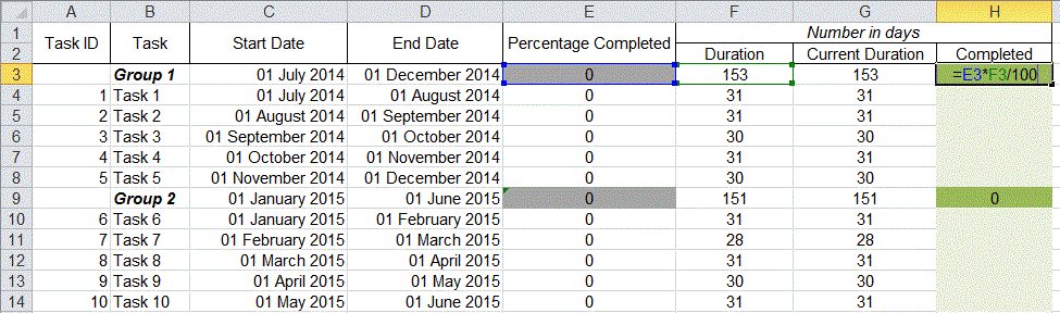
Figure 8
Creating the Gantt Chart
From the top menu select Insert, then in the charts section select Bar and click the Stacked Bar.

Figure 9
You now have a blank chart. To populate the chart with the data we created earlier right click and click Select Data.

Figure 10
The Select Data Source window will appear.

Figure 11
Click the Add button. The Edit Series window will appear. In the Edit Series window click the first table symbol with a red arrow called Series Name.

Figure 12
Now click the “Start Date” cell. Then click the symbol with the red arrow pointing downward in the Edit Series window.

Figure 13
In the Edit Series window click the second table symbol with a red arrow called Series Value. Click and drag to select the “Start Date” range. Once selected click the symbol with the red arrow pointing downward in the Edit Series window.

Figure 14

Figure 15
Click OK in the Edit Series window. We should now have our "Start Dates" in our Select Data Source window. Repeat the above process to add the “Current Duration” and “Completed” columns so our Legend Entries (Series) in the Select Data Source window. You can do this by clicking Add.

Figure 16
Your Legend Entries (Series) in the Select Data Source window should look something like Figure 17.

Figure 17
Now we will add our “Task ID” and “Tasks” to the Horizontal (Category) Axis Labels in the Select Data Source window.
You do this by clicking the Edit button on the right side of the Select Data Source window.
The Axis Labels window will appear click table symbol with a red arrow called Axis Label Range.
Drag and select the range from the first task id to the last task in the list. Next click the symbol with the red arrow pointing downward in the Edit Series window, click OK.

Figure 18
Your Select Data Source window should look like this.

Figure 19
Click OK
Resize the graph by dragging the edges outwards to your desired size.
Right click the Task ID and Tasks on the graph and click Format Axis.

Figure 20
Tick Categories in reverse order then click OK

Figure 21
Right click the dates in the graph and click Format Axis.
Copy the Axis Options information in the image below. Note: dates in excel are represented as numbers the formula for calculating the number of any given date is =DATEVALUE("7/7/2014"). The Major unit is the spacing between dates and this is measured in days for example below I have used 30 day gaps.

Figure 22
Click on the alignment menu in the Format Axis window. Set the Custom angle to -1 then click Close and resize your graph so that everything is displaying accurately.

Figure 23
Right click the blue section or the Start Date section of the bars in the graph and click Format Data Series. In the Format Data Series window change the Fill to No fill and the Border Color to No Line and click Close.

Figure 24

Figure 25
You can also change the colour of the “Current Duration” section of the bar by repeating the above process but this time select Solid fill and chose your desired color.
Now you Project Plan is complete and ready to use, all you have to do is enter the number of days you have spent on each task in the light green cells under the “Completed” column and the rest will update automatically.
Figure 26